Overview
This was a collaboration project with project manager & tech educator Jessica Duarte at Jess, please! I filled the role of website designer and developer.
Our client, T. Lopez, is an experienced yoga instructor based in the Brampton, Ontario area. She has taught yoga at multiple yoga studios throughout her career.
Roles
Brand Designer
Web UX/UI Designer
Frontend Web Developer
My Contributions
- Generated a new personal brand that reflected T. Lopez’s unique values and teaching methods.
- Developed an interactive activity tool that bridges the client’s objectives with user experience.
- Designed and developed a WordPress website that was simple and easy to navigate for users.
Background
Because T. Lopez is continuously growing her client base from different venues, she wanted a new website where she could feature studio and online classes as well as her masterclasses.
The main purpose of the website was to provide class and instructor information to customers.
The website’s secondary mission was to create and solidify T. Lopez’s brand identity.
Challenges
- Develop a new personal, aesthetic brand identity that reflects T. Lopez’s values and visions.
- Efficiently layout the client’s textual content and photoshoots in an easily digestible format for users.
- Integrate T. Lopez’s class information and upcoming event schedules in a simple and user-friendly way.
- Streamline the various registration and payment systems for each studio.
- Maintain an easily scalable and budget-friendly website with a low maintenance fee.
Solutions
- Ideated and designed brand visual identity using the client discovery meeting results and the client’s inspirational photo.
- Divided the ‘About’ page into 3 subpages where Tere’s value, experience, and teaching methods were clearly explained with relevant photos.
- Through intensive research and user testing, implemented a free event calendar plug-in into the WordPress website.
- Added Call-To-Action buttons in the class detail pages and linked to the venue’s class registration or payment pages.
- Modified a free, existing Gutenberg theme design into a personalized and branded interface design that would remain accessible to the client over time.
Design Process
1. Discovery
To understand T. Lopez’s business objectives, website goals, and target users in a more fun and interactive way, I created a Discovery Activity Board based on the discovery meeting questions that I came up with.
This collaborative tool was significantly useful in finding the sweet spot between the client’s needs and the user-centric design approach.
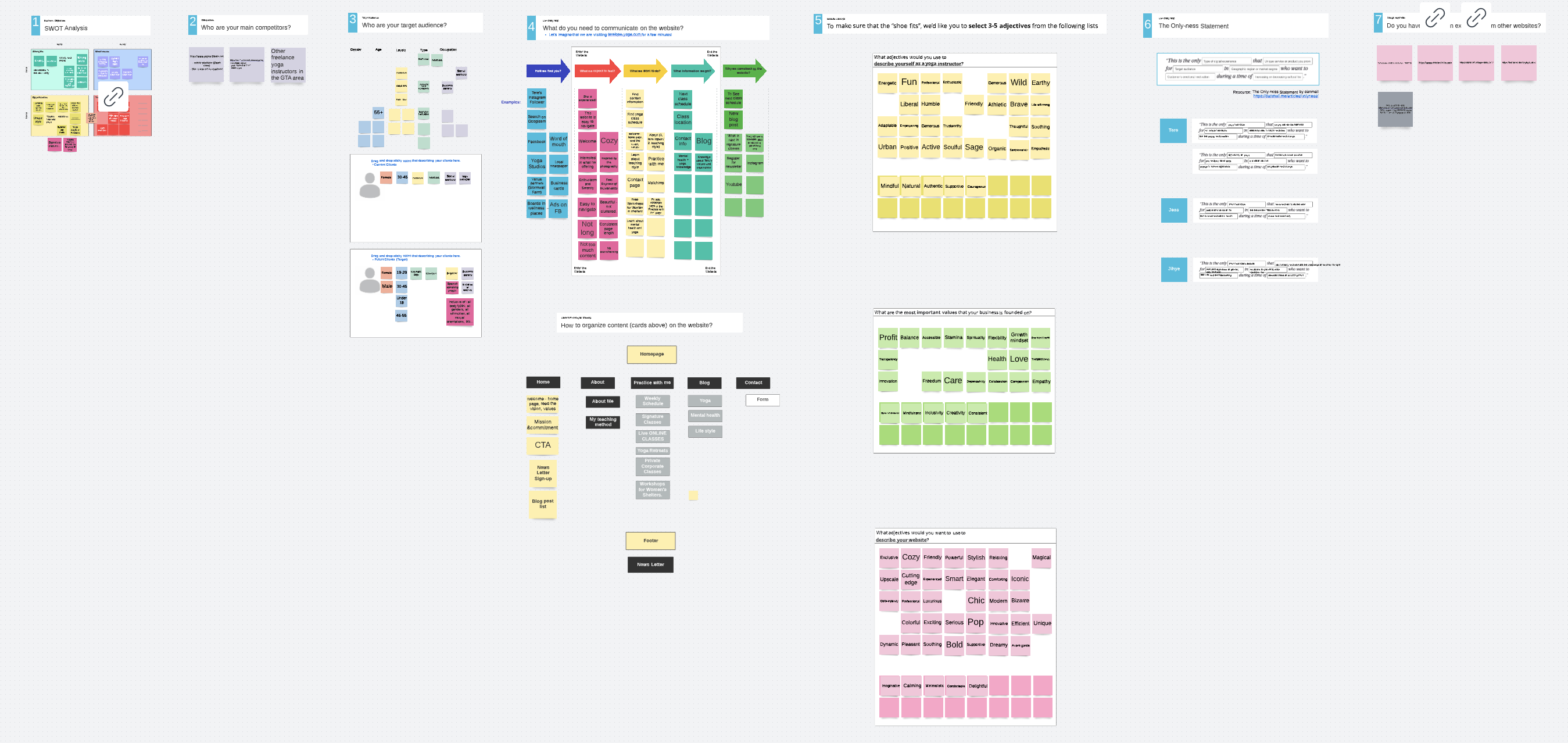
Discovery Activity Board Questions
- SWOT Analysis
- Who are your main competitors?
- What is your target audience?
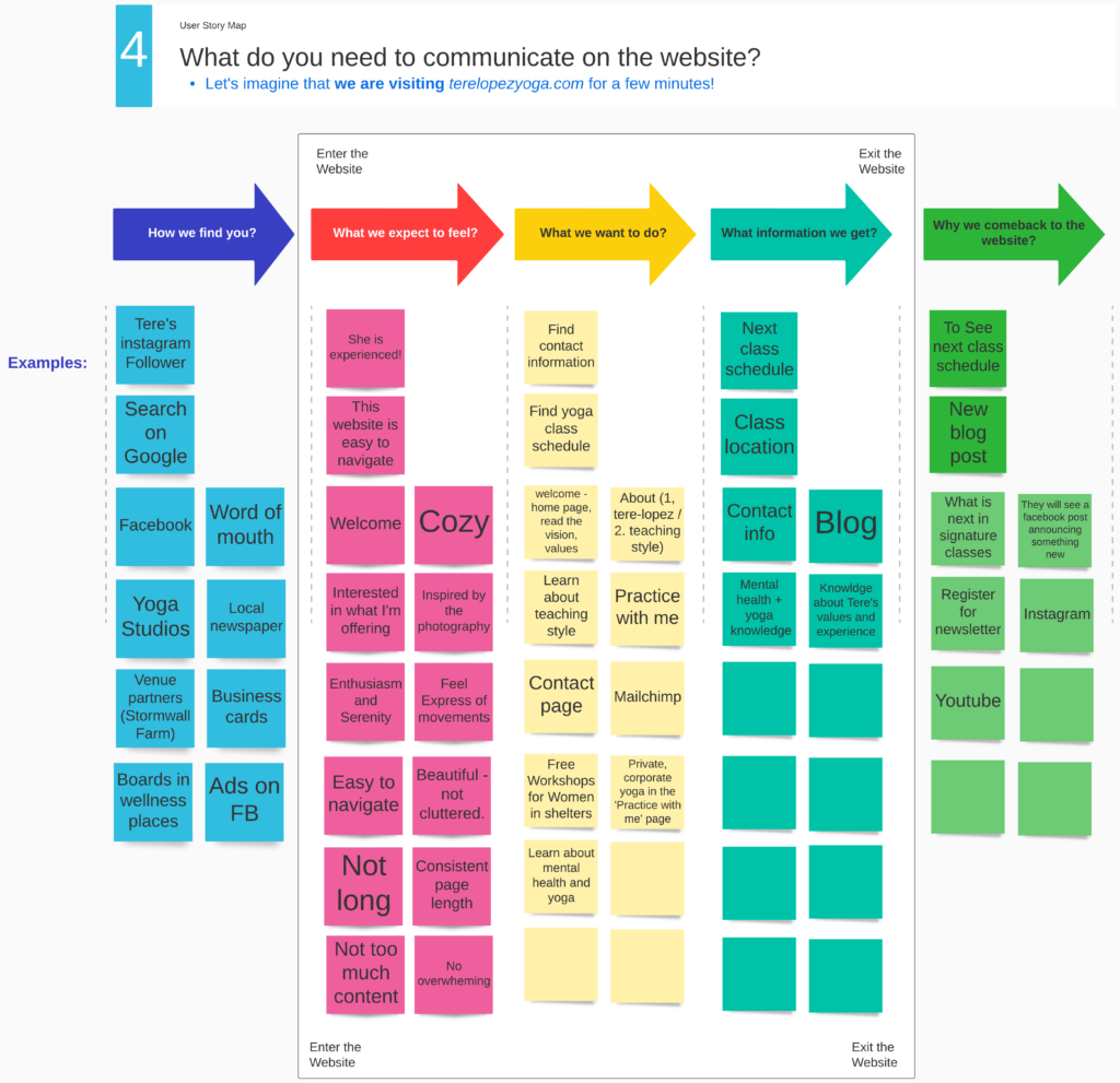
- What do you need to communicate on the website?
- Select 305 adjectives from the following lists.
- The Only-ness statement
- Do you have any design examples from other websites?
2. Definition
Based on the discovery exercise findings, my project manager and I prioritized website features that could generate a bigger impact on users.
Information Architecture
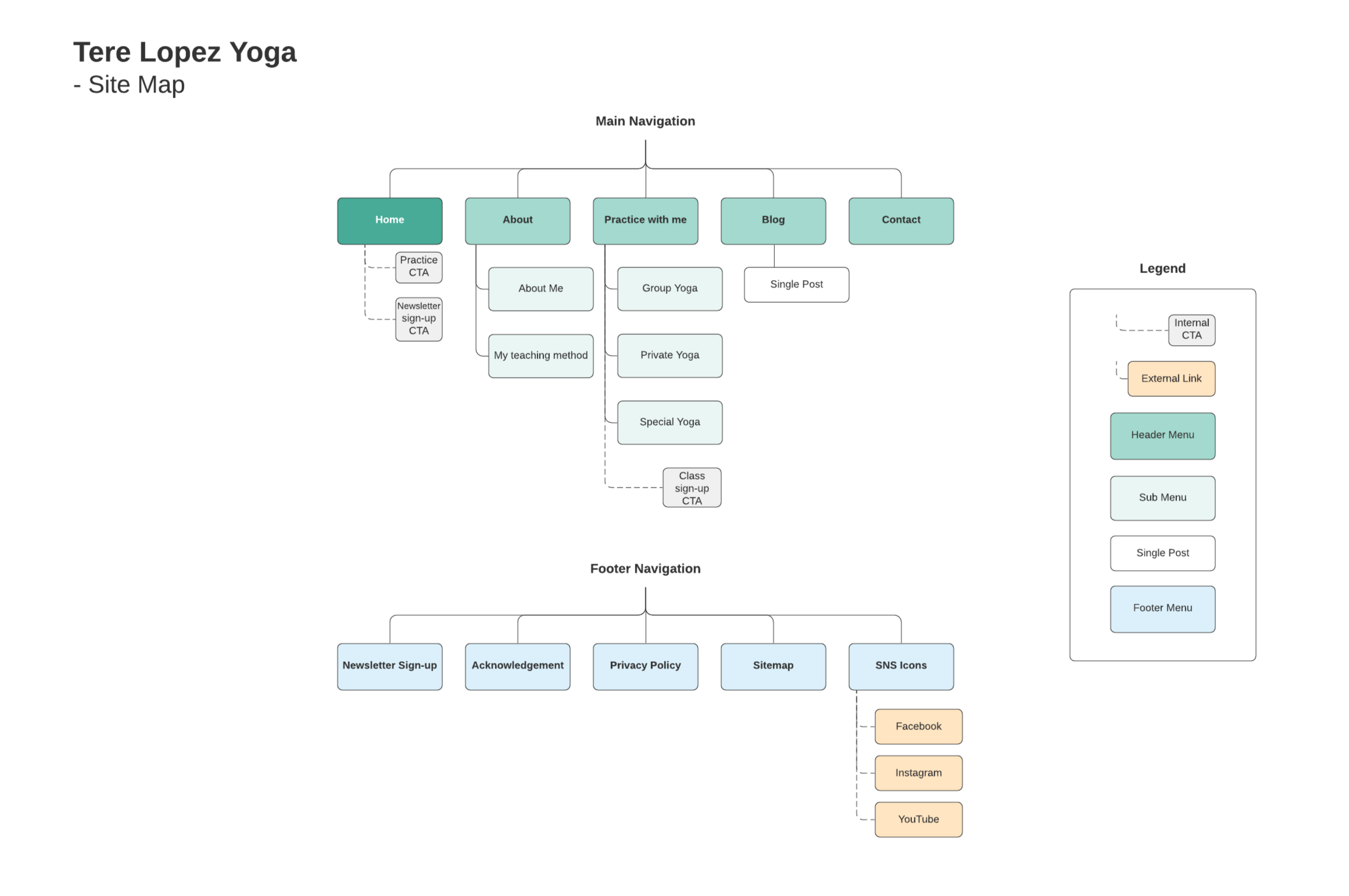
I created a website sitemap that shows a high-level overview of the website. This information architecture includes header and footer navigations.
Content Plan
Alongside the site map, I also did a deep dive into the brand and website visual concepts. I created a content plan and delivered it to the client to add meaningful and engaging content that would boost the overall appeal of her business.
3. Development
To solve the identified challenges and meet the project requirements, I experimented with a diverse range of elements in my design exploration. The client shared her inspirational brand photo with me, and it became the starting point of my design solution process.
Design Exploration
- Colours
- Logos
- Fonts
- Imageries
- WordPress Theme Previews
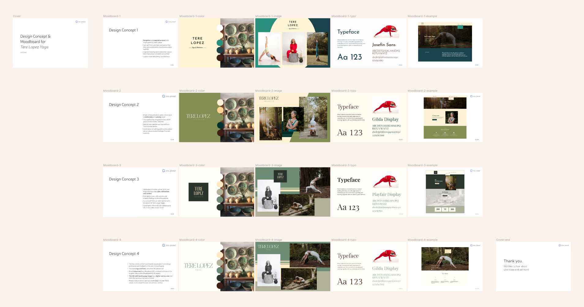
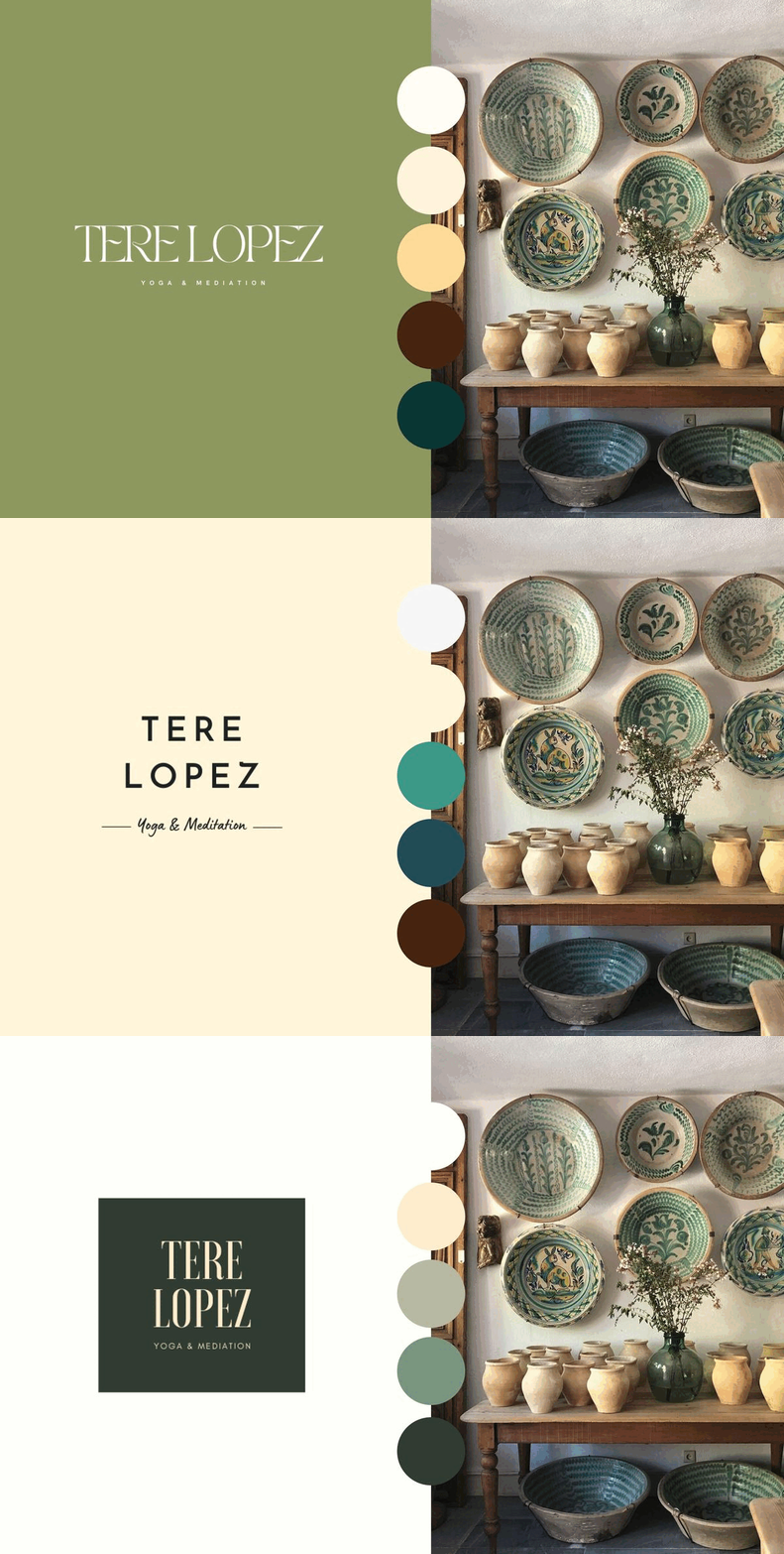
Logo & Color Exploration
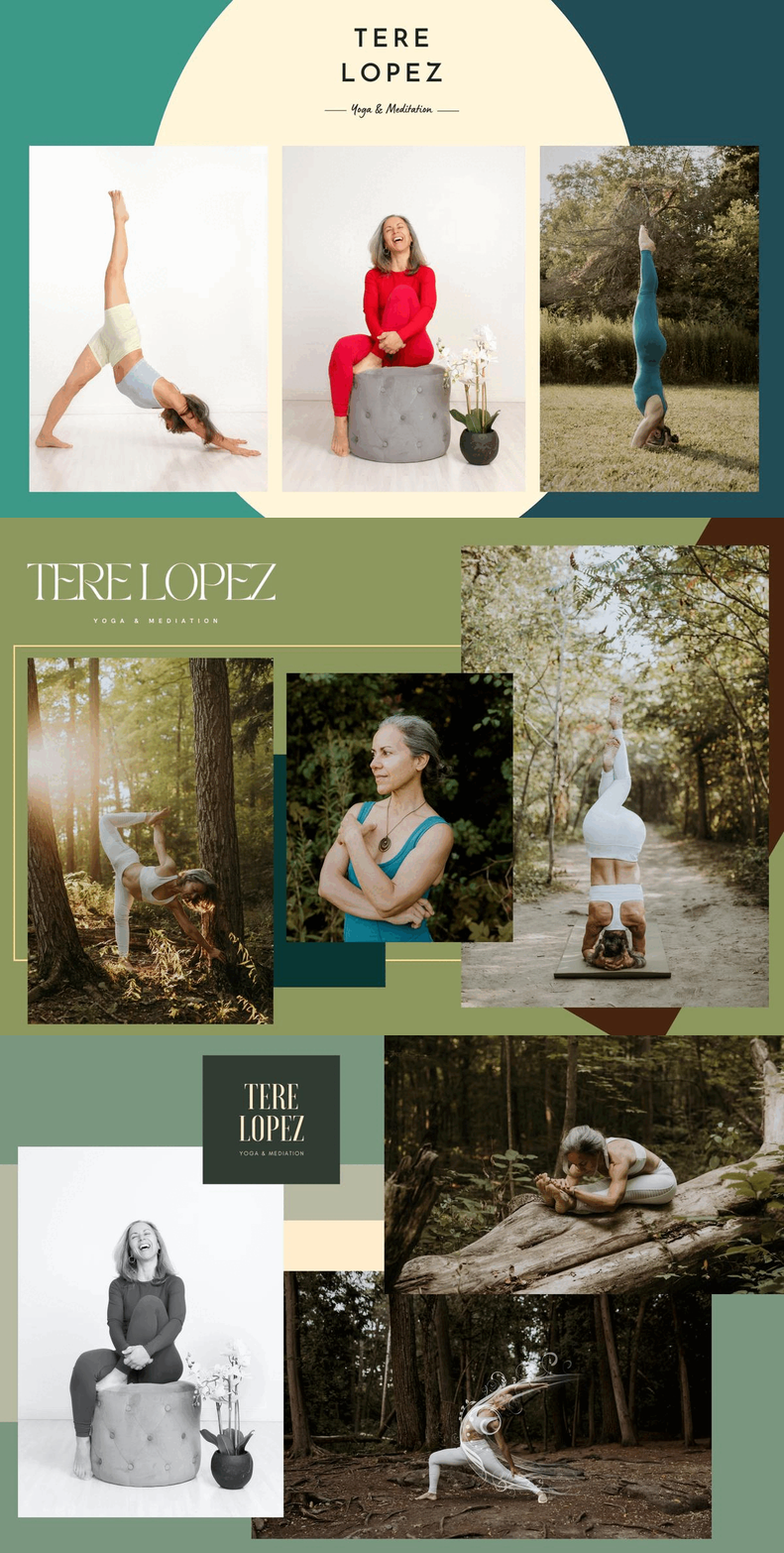
Imagery & Color Exploration
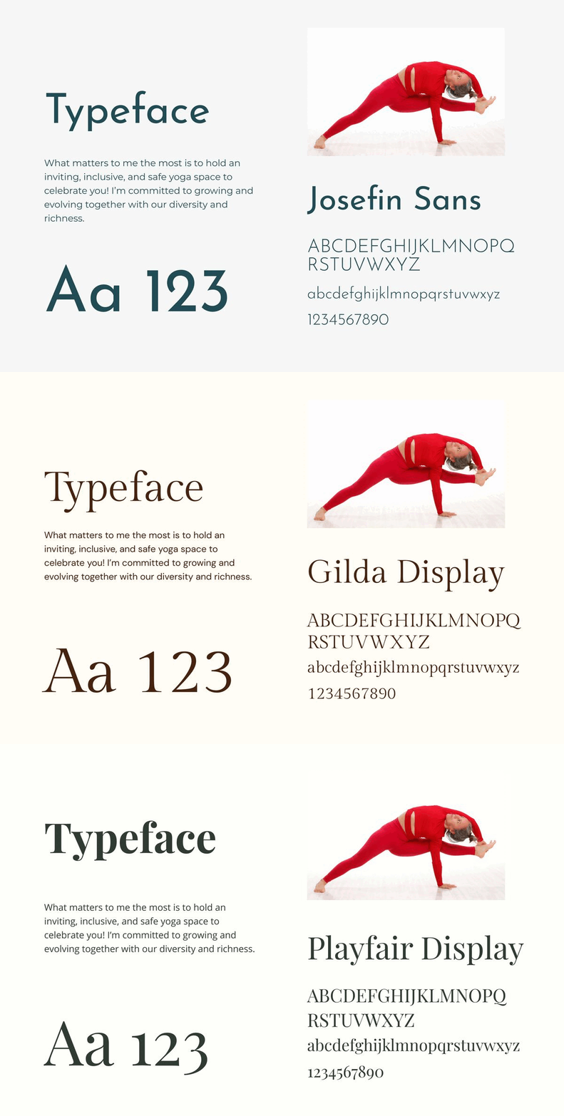
Typeface Exploration
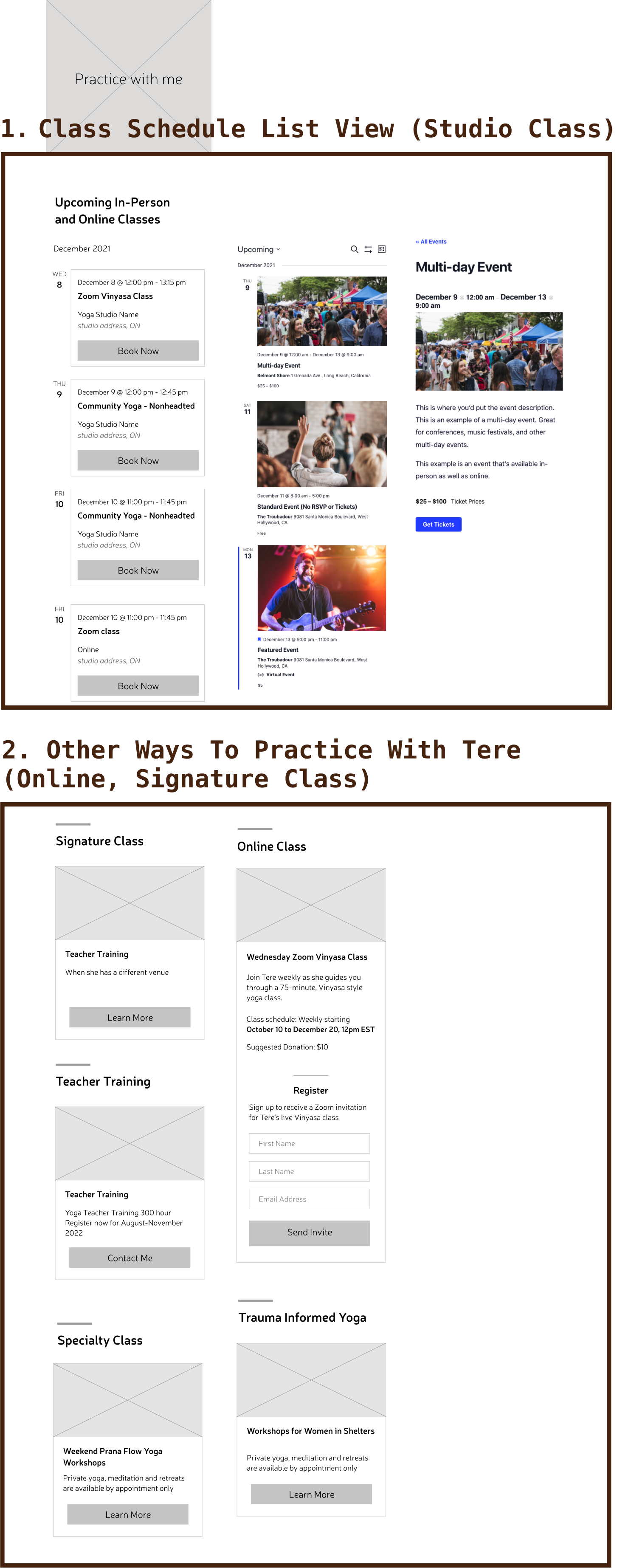
Class Schedule Page Exploration
Goals of the class schedule section
- Users should be able to find class info and easily sign-up at yoga studios
- The client should be able to comfortably update new classes and workshop schedules
- Schedules that have already passed should be automatically deleted
Page layout components
- List of the upcoming online classes and studio classes
- Other ways to practice yoga with T. Lopez
- Class registration information
4. Deliver
The final version of the design concept was created by incorporating the client’s design preferences and feedback.
Logo design
For the logo and main font typeface, I chose the ‘TAN Pearl’ font which uses imaginative lines to project a fresh, modern aesthetic.


colour palette
To evoke a comfortable and calming mood reflective of T. Lopez’s authentic yoga style, I chose sunshine yellow and serene green colours.

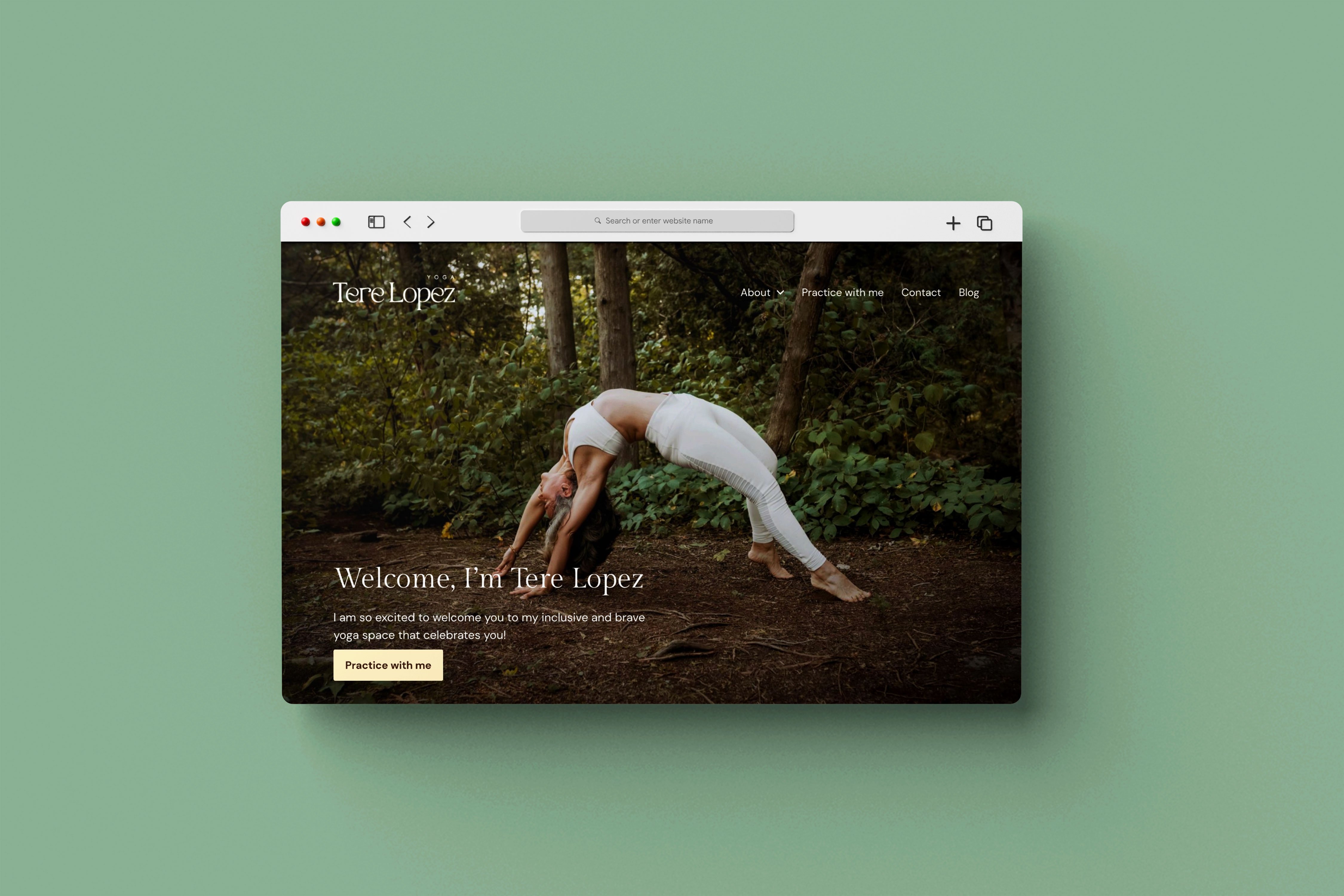
Impactful Landing page design
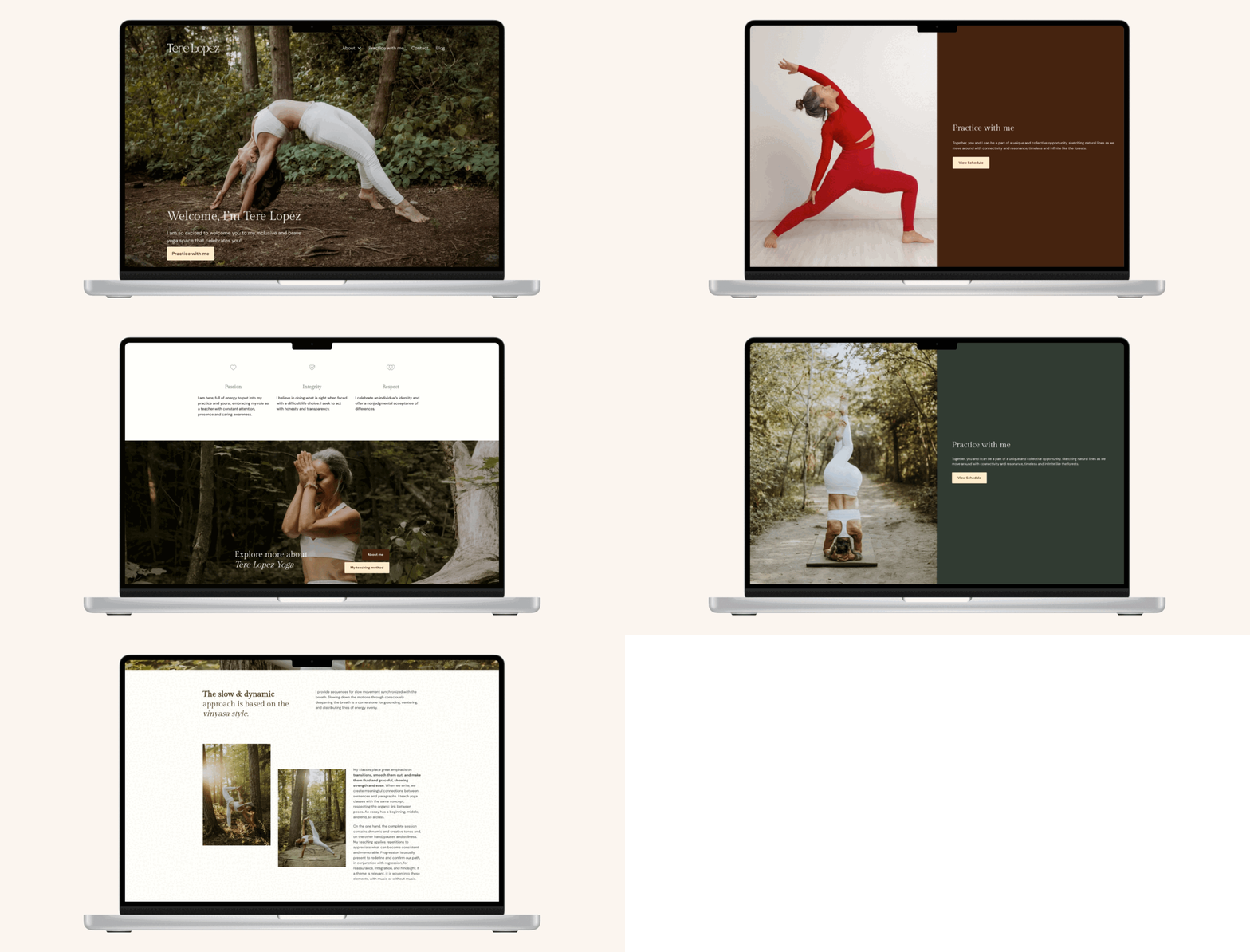
I set the hero image on the landing page to full-width, to mirror the feeling of opening a nature book to an expansive scene.
Multiple Entries to the Class Schedule
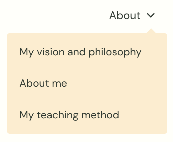
Users can easily find T. Lopez’s class schedule by navigating the ‘Practice with me’ page. I also added a schedule calendar widget and additional CTA’s in the website footer section to hook clients at different visual viewpoints on the site.
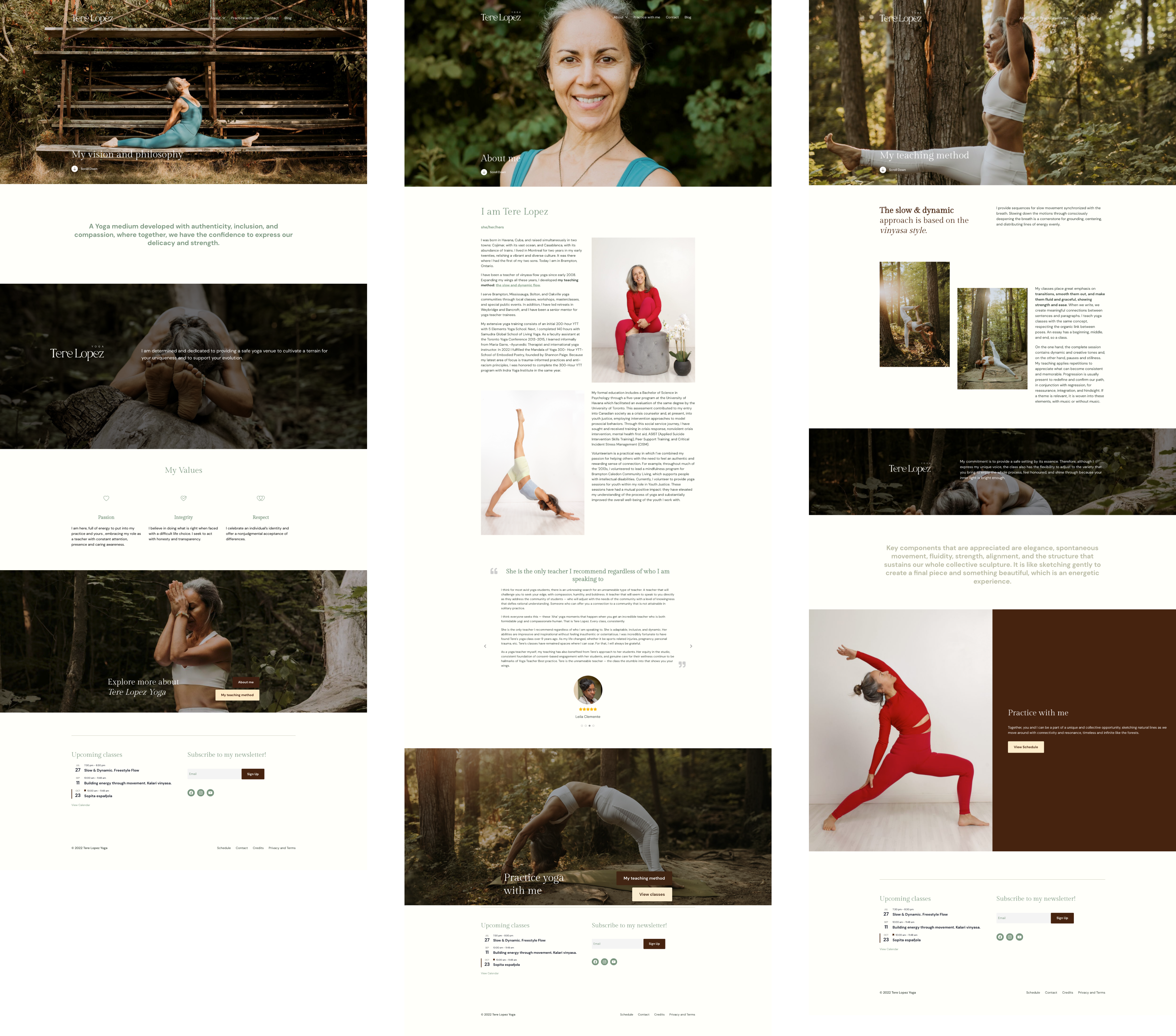
‘About’ Subpages for Content Accessibility
I divided the ‘About’ page into 3 subpages where T. Lopez’s value, experience, and teaching methods are clearly explained along with the relevant photos.
In this way, users can easily sift through and process the information while recognizing T. Lopez as a mindful yoga instructor.
Results
A Happy, Satisfied Client
My client T. Lopez was always in the loop throughout the project. She was very responsive to our iterative design process and expressed a high level of appreciation for the way we helped in streaming her business. Our two-way communication and strategic design process ensured the quality of the final product and also reduced the design and development time.
Now she can easily update her new class schedule and actively utilize her website as an integrated marketing platform.
Below is Tere’s testimonial note, proudly mentioned on her Credits page.
I am so thankful to Jess and Jihye at Jess, please!. How fortunate I feel to have found this team. Their ideas are inviting, their talent unconquered, and their abilities are abundant. But it is the humbleness, kindness, and respect shown in every moment that has made a bow of profound gratitude.
tere lopez yoga
