Overview
The Aftermetoo Resource Roulette is a significant UX design project centered around aiding individuals in Canada who have experienced workplace sexual harassment and are dealing with trauma as a result. Recognizing that these users may have difficulty absorbing information in traditional formats, Aftermetoo sought to create a more user-friendly, engaging, and less overwhelming way to navigate resources.
My Role
As a UX designer, my role encompassed the conceptualization, design, and iterative refinement of the Resource Roulette feature on the Aftermetoo website. This involved designing from wireframe to interactive prototype, incorporating user flows, and tailoring the user experience to address the needs of a highly sensitive user group.
Design Process and Iterations
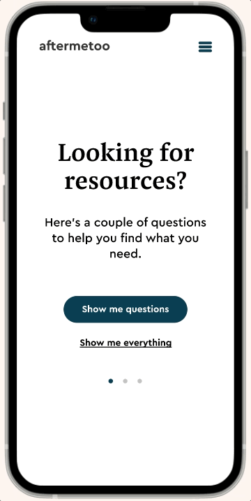
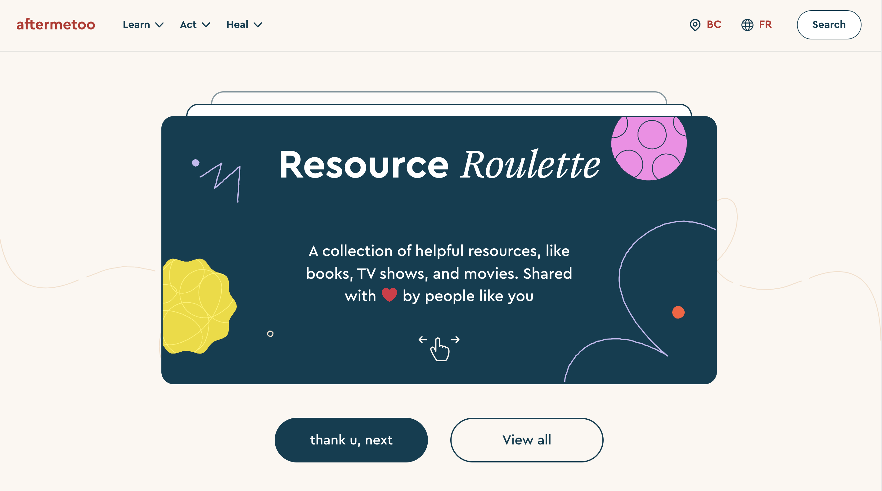
The design process began with a thorough understanding of the users’ specific needs and limitations due to their traumatized state. A key objective was to make the resource discovery process less overwhelming and more intuitive, replacing traditional list views with a fun, engaging, and easy-to-navigate roulette design.
The project underwent five major design iterations, each one shaped by continuous feedback and agreement from the Aftermetoo director and project manager. Each stage aimed to refine the experience and make it more comforting and straightforward for traumatized users.
After I completed my part of the design work, the project was handed over to a design agency to develop the final high-fidelity mockups and interface.
First Iteration
Information Architecture and User Flow Foundation
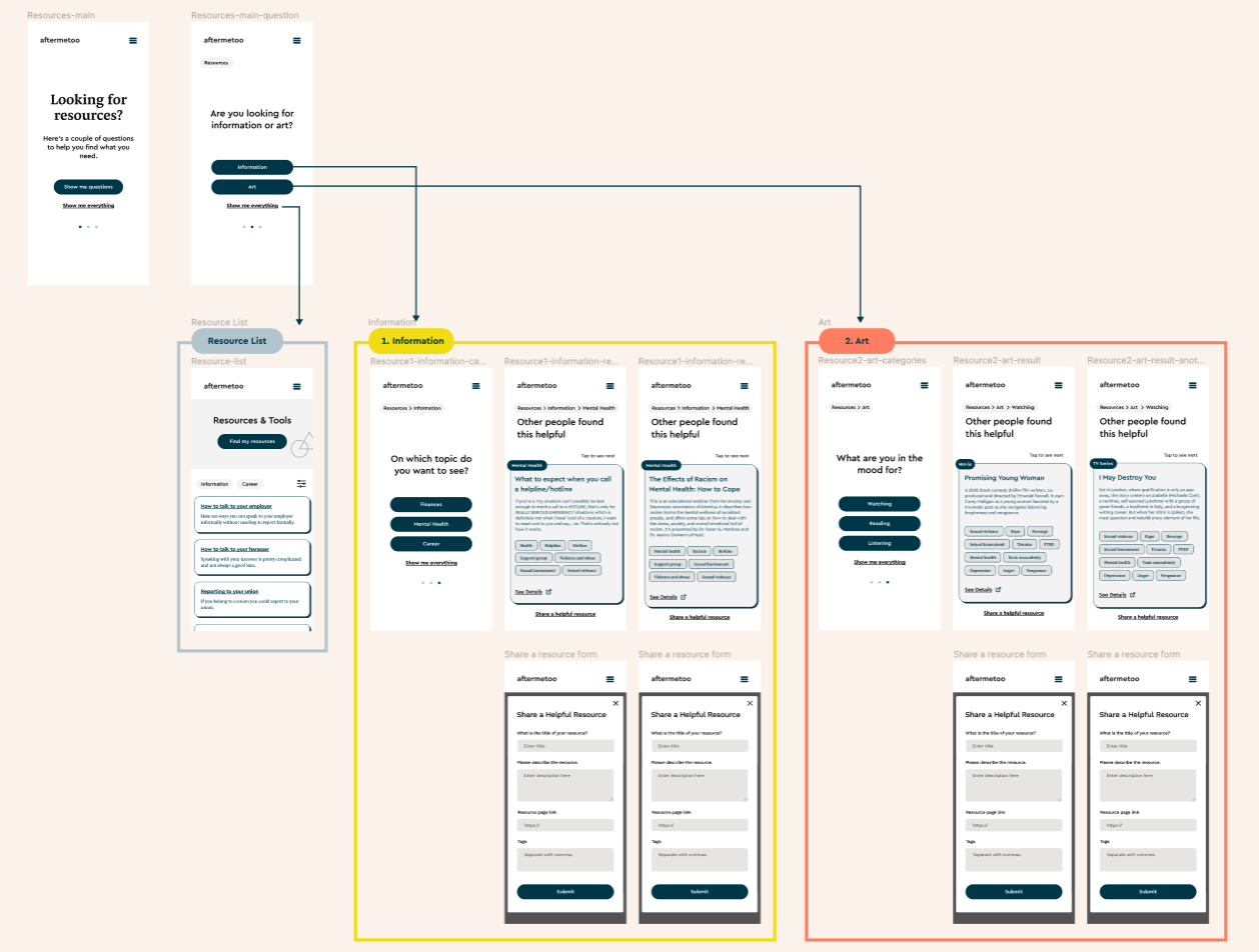
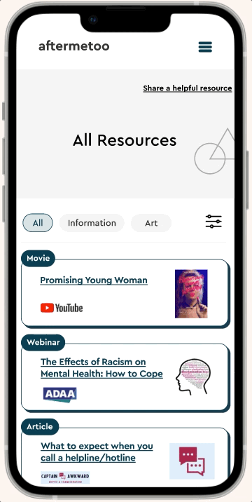
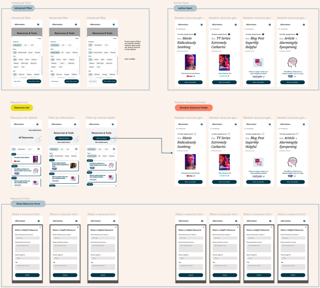
In the initial stage of the design process, I centered my efforts on constructing an effective information architecture and developing user flows. At this stage, we had two types of resources – Information and Art. I designed a wireframe where users could navigate through different screens by choosing buttons. Each button was linked to a specific resource type with associated sub-categories, forming the foundation of the user’s navigational journey.
Second Iteration
Enhancing Visual Appeal and Trustworthiness
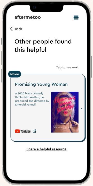
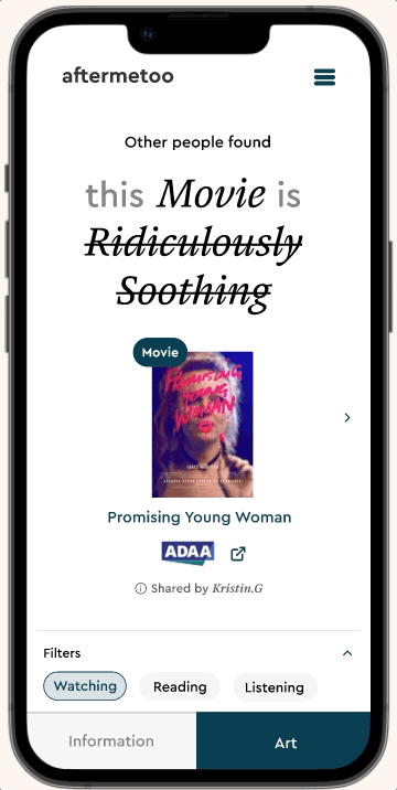
The next step involved transforming the resources into visually appealing and engaging card designs. These cards included short explanations and thumbnail images, thereby providing users with an at-a-glance understanding of the resource. To reinforce the credibility and reliability of the information, I incorporated the source of each resource directly onto the card, instilling users with confidence in the resource’s validity.
View in Figma
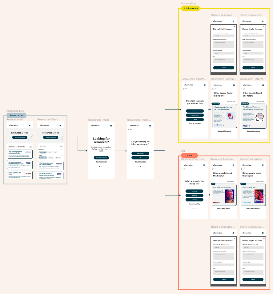
Third Iteration
Fostering Emotional Connection and Community through Language
In a significant innovation, I proposed using adjectives and adverbs to establish an emotional bond with users and demonstrate empathy. These linguistic elements replaced long resource descriptions, enabling a visually dominant and more easily scannable design. The aim was not only to simplify information but also to evoke emotions and foster a sense of community, helping users feel understood and supported in their journey.
View in Figma
Fourth Iteration
Enhancing User Engagement
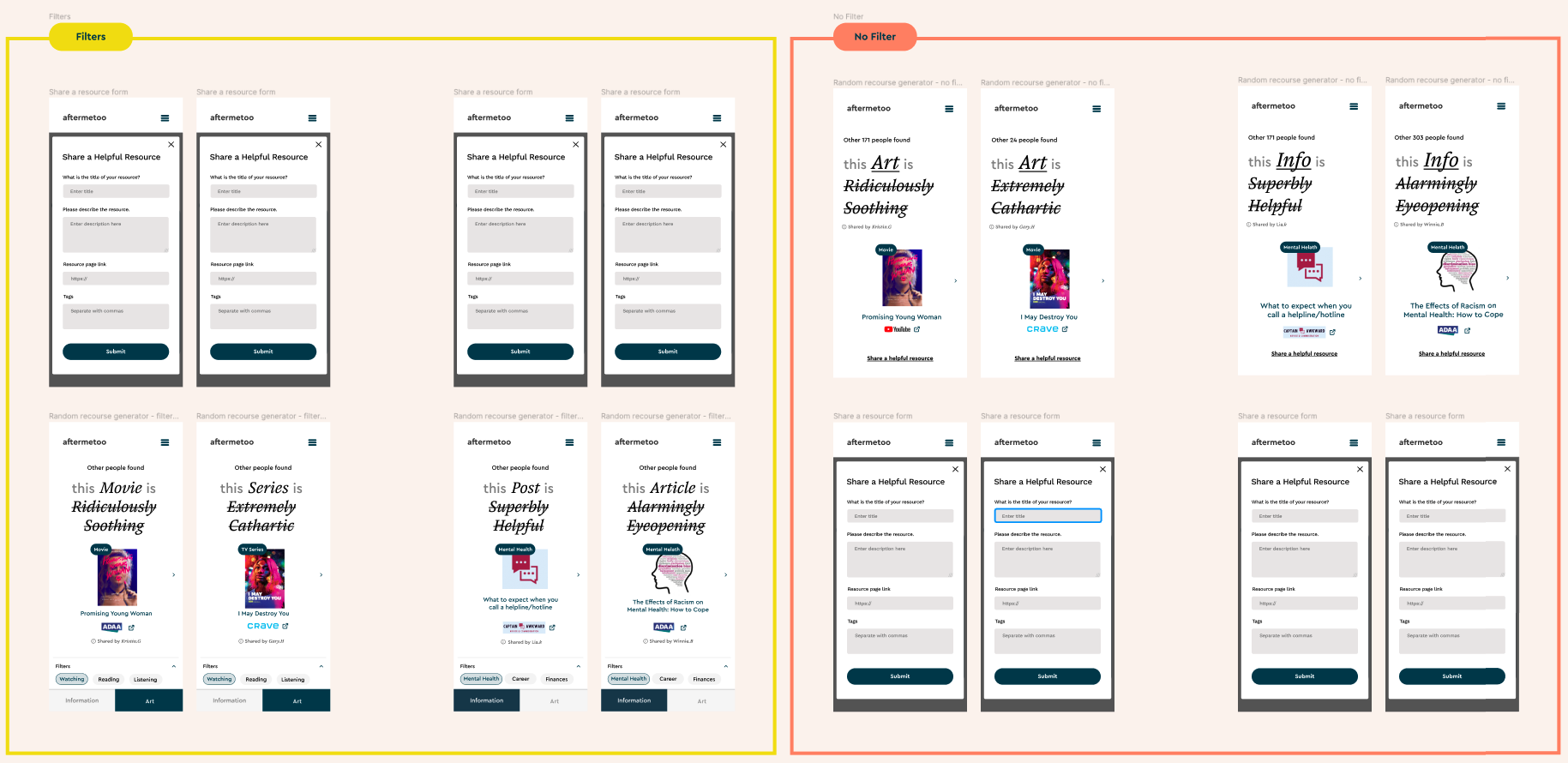
In the fourth design iteration, I incorporated a ‘heart’ icon into the resource cards to stimulate user interaction. Users could ‘like’ resources that they found emotionally resonant, with the total number of ‘likes’ updating in real-time to reflect collective sentiment. This social proof mechanism fostered a sense of community and validation.
Personalizing Resource Discovery
At this stage, I also began designing the conventional resource list view, complete with filter functions. Users could utilize keyword icons to personalize their resource discovery process, with an open filter view facilitating a more tailored browsing experience.
View in Figma
Final Iteration
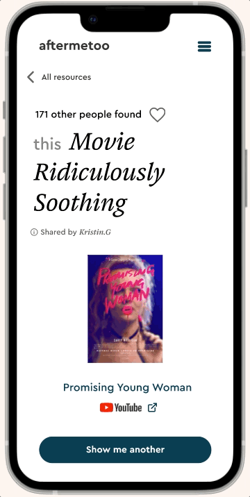
Streamlining the User Journey and Facilitating Navigation
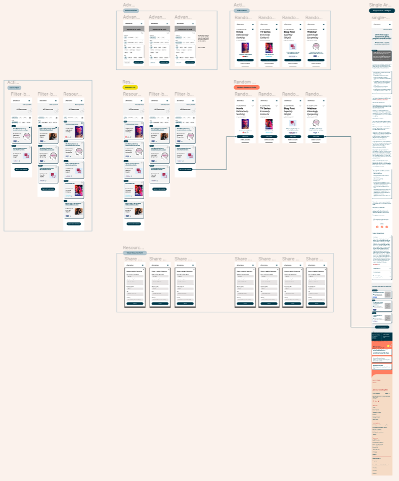
In the final iteration of my UX design phase, I focused on consolidating the entire user journey, including individual article views and associated widgets. To ensure seamless transitions between these two key areas, I strategically incorporated navigational buttons, thereby creating a smooth and intuitive user experience.
Insights and Takeaways
This project highlighted the value of the iterative design process. Each round of changes, based on important feedback, brought about a more user-friendly design. The end result was a well-crafted interface, ready for final touches and development.
One of the biggest takeaways from this project was realizing the importance of empathy in UX design. It was crucial to create a design that wasn’t just easy to use, but also emotionally supportive for those going through tough times.
Overall, the project emphasized that good design combines functionality with understanding people’s feelings and experiences. Using an iterative process was key in achieving this, making sure that each step improved the user experience.